Wearables
Wearables provides readers with a practical look at the trends that are impacting the decorated apparel market, which accounts for more than a third of all promotional products sales. Packed with strategies and trends for companies that sell decorated apparel, Wearables is the go-to source for imprinted apparel information.

'Friends' Merch Benefits Charitable Causes
WearablesThe first swag drop is available for a limited time.
Read More
How To Do Mobile Embroidery Right
WearablesMobile embroidery can be a great way to increase your revenue while also marketing your...
Read More
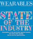
State of the Decorated-Apparel Industry
WearablesOptimism has bounced back after last year’s uncertainty, and decorators are ready to ta...
Read More